
Also, here's another fun site that shows the current location of the planets. CLICK HERE to take a look. You can change the settings in the windows beneath the image. The site is developed and maintained by Chris Peat of Heavens-Above.
Also, here's another fun site that shows the current location of the planets. CLICK HERE to take a look. You can change the settings in the windows beneath the image. The site is developed and maintained by Chris Peat of Heavens-Above.

Retrograde motion is a tough one to explain to students without some sort of visual aid. This animation by the University of Nebraska is a very helpful tool. CLICK HERE to watch it.
To learn more about retrograde motion, including the Ptolemaic model and the Copernican model, CLICK HERE (courtesy of LaSalle University).

Here's another resource related to valley (alpine) glaciers created by the PhET (?) project. The PhET™ project at the University of Colorado provides interactive, research-based simulations of physical phenomena for free. Check out this Glacier Simulation (select "run now") and then browse through their other Earth Science-related simulations
To view a convenient list of all the resources that have been posted on this "Earth Science Guy" blog site, CLICK HERE.
Below: Speaking of glacial movement, this 48-second segment from NOVA shows 5 months of ice-flow from BENEATH Mt. Blanc in the Alps.
To view a convenient list of all the resources that have been posted on this "Earth Science Guy" blog site, CLICK HERE.

CLICK HERE to see the resource - Once the page opens up, select "before" or "after" in the upper right to compare.
To see an image comparison from a satellite view (courtesy of NASA), CLICK HERE. To see one more from the Washington Post CLICK HERE.
To view a convenient list of all the resources that have been posted on this "Earth Science Guy" blog site, CLICK HERE.
To view a convenient list of all the resources that have been posted on this "Earth Science Guy" blog site, CLICK HERE.

CLICK HERE to view the animation.
This recent volcanic activity at the Craters of the Moon is thought to be caused by "leftovers" from the hot spot that currently sits beneath Yellowstone Park. In fact the Snake River Plain IS the path of the hot spot* over the past 15 million years. To learn more about the geologic past of this area CLICK HERE.
Another interesting aspect of the hot spot is the impact it had on ancient rhinos in Nebraska - CLICK HERE to learn more about that chapter in the geologic story of the area.
*Actually, it is the North American Plate that has been moving over the stationary hot spot.

For what I'm interested in, this is one of the best resources I've come across in awhile. The very impressive site includes photos, diagrams, text as well as short PodCasts. Each day Gibson helps the reader/listener understand one aspect of Earth's history. You can go back to January 1st and get caught up, or you can pick and chose based on your interests. I have always been fascinated with the "Belt Supergroup", so I wanted to see what Gibson had to say about it - I found that it had been the focus of his January 24th post, and I was not disappointed! Belt Basin
Map courtesy of Idaho State University


Students results will vary because they are kids! - AND not all granites, basalts, and gabbros contain exactly the same minerals. According to About.com the density of granite ranges from 2.6-2.7 g/cm3 and basalt is 2.8-3.0 g/cm3. Since gabbro and basalt are made of the same minerals, their densities are similar. Gabbro's density ranges from 2.7-3.3 g/cm3.
The day after the lab is a good time to question the students about the significance of rock densities. Here are some questions for discussion:
1. What do you think causes some rock types to have higher densities than others? (Assuming there are no air pockets in the rock, the types of minerals will determine the density. Granite contains lots of quartz and feldspar - both fairly light minerals, whereas basalt and gabbro are made of heavier minerals.)
2. Consider a zone of subduction. Why is it that when ocean crust and continental crust collide, the ocean crust always goes under the continental crust, and not vice versa? (Ocean crust is made of basalt and continental crust is mostly granite.)
3. Which would be less dense - granite, or magma that contains the same minerals as granite? (The molten minerals would less dense for the same reason hot water is less dense than cold water, and hot air is less dense than cold air. Molecules that are moving faster tend to be farther apart. This is why molten material tends to melt its way to the surface. It's a density thing!)
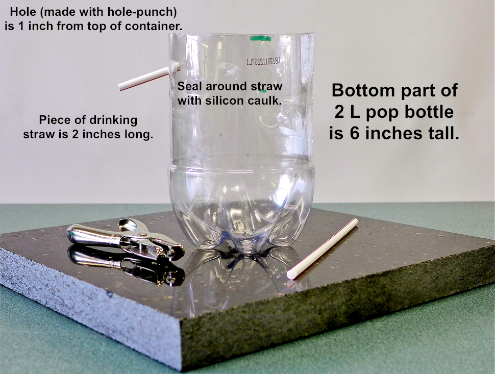
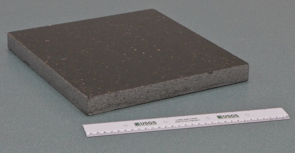
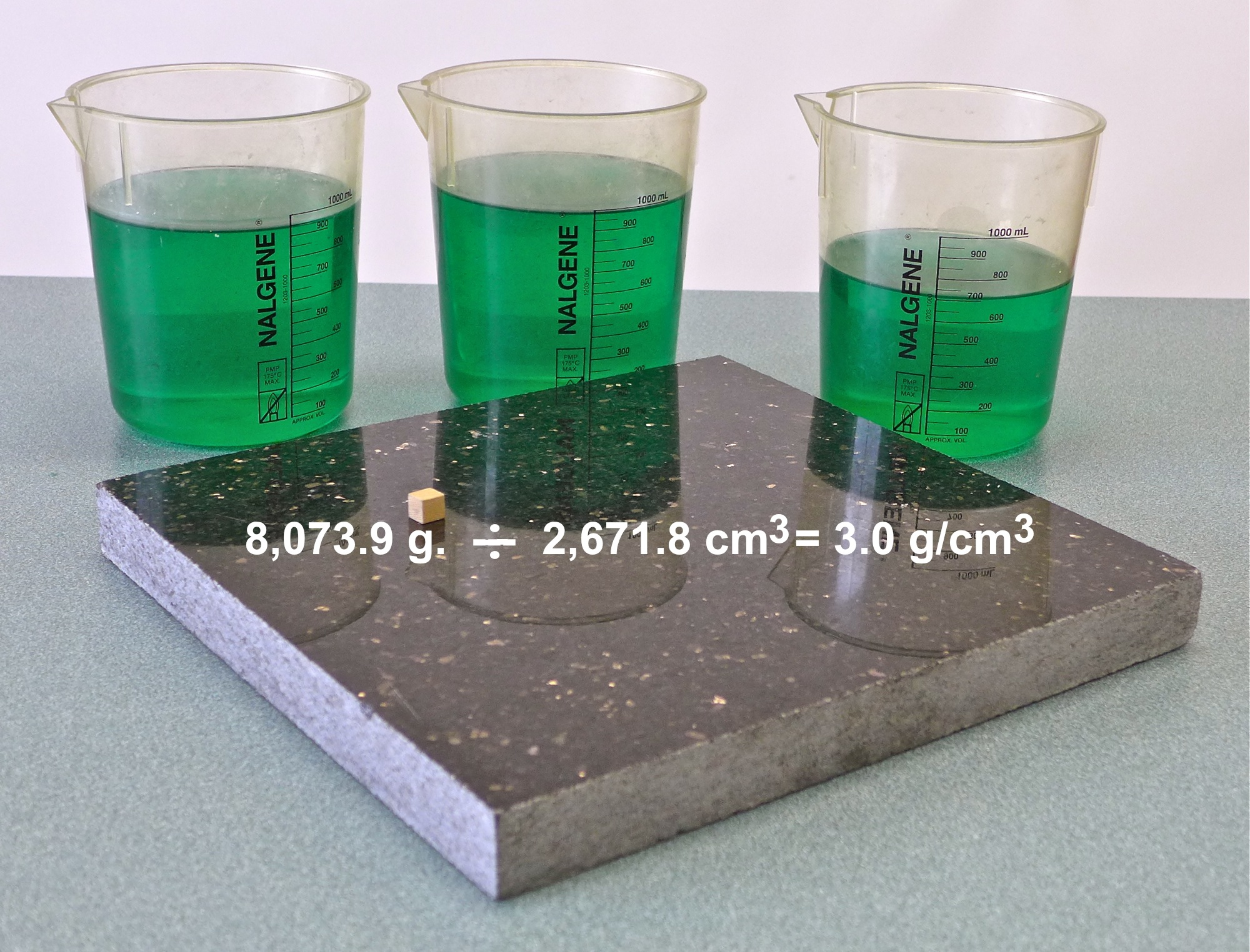
4. I have a large scrap of gabbro counter-top, and I ask students, "How would you determine the density of this piece of gabbro ?" (They would need to find the mass, and then measure the length, width, and height to determine the volume in cm3 -> photo.) The slab weighs 17.8 lbs. (8,073.9 g.) so the density is 3.0 g/cm3 (photo.)
5. I have a large irregular sample of porphyry that fits in the aluminum overflow container, but has a volume that exceeds 100 mL. I ask, "How would you determine the density of this, using the equipment used in your lab?" (They would need to pour 100 mL of the overflow into the graduated cylinder, empty the cylinder, and repeat, keeping track of the total amount poured into the cylinder.)

For more about this eruption, which happened on February 1 and killed 14 people, CLICK HERE.
Here is a NASA satellite image of one of the pyroclasitc flows after it settled on the slope of the volcano: photo

If you liked that, check this site out: http://hint.fm.wind.
To view a convenient list of all the resources that have been posted on this "Earth Science Guy" blog site, CLICK HERE.

This photo was taken in the Spanish Peaks south of Bozeman, MT. To learn more about the processes that form gneiss, CLICK HERE.

In my quest to learn more, I found a few websites that provided explanations posted by various organizations. The State Climate Office of N. Carolina provides a general explanation that was very helpful, considering my limited expertise in this area. According to the climate office, The Pacific Decadal Oscillation (PDO) is a pattern of Pacific climate variability similar to ENSO (El Niño - Southern Oscillation) in character, but which varies over a much longer time scale. The PDO can remain in the same phase for 20 to 30 years, while ENSO cycles typically only last 6 to 18 months. The PDO, like ENSO, consists of a warm and cool phase which alters upper level atmospheric winds (compare PDO and ENSO). Shifts in the PDO phase can have significant implications for global climate, affecting Pacific and Atlantic hurricane activity, droughts and flooding around the Pacific basin, the productivity of marine ecosystems, and global land temperature patterns. Experts also believe the PDO can intensify or diminish the impacts of ENSO according to its phase. If both ENSO and the PDO are in the same phase, it is believed that El Niño/La Nina impacts may be magnified. Conversely, if ENSO and the PDO are out of phase, it has been proposed that they may offset one another, preventing "true" ENSO impacts from occurring.
According to the University of Washington's Joint Institute for the Study of the Atmosphere and Ocean (JISAO), during the warm phase (aka positive phase), higher than normal sea-surface heights caused by warm water form a horseshoe pattern that connects the north, west and southern Pacific, with cool water in the middle (map). During most of the 1980s and 1990s, the Pacific was locked in the PDO's warm phase (see graph below), during which these warm and cool regions are reversed. The JISAO site also notes that "Pacific Decadal Oscillation" was coined by fisheries scientist Steven Hare in the mid-1990's while researching connections between Alaska salmon production cycles and Pacific climate.
Like the ENSO, the cause of the PDO is not understood - and like the ENSO, we may be hearing (and learning) more about the PDO in the years to come. Finally, here is a 6-minute YouTube explanation of the POD.


The NASA graphic above shows the correlation between ozone depletion, the location of the vortex, and temperature over the Arctic. The globe on the left shows that there is ozone depletion over the Arctic (every spring), but it is not bad enough to be called a "hole". To learn more about why ozone loss is worse over the South Pole, why the hole only forms in the spring (Sept-Oct), and the conditions that team up to cause the hole, CLICK HERE.
Although, the southern vortex is bigger, stronger, and lasts longer than its northern counterpart, it was the northern polar vortex grabbing all the headlines last week. There's NEVER been as much news coverage about the vortex as there was during the recent cold spell - In fact, very few Americans had ever heard of the polar vortex until this outbreak of cold weather. Here are some sources that may be helpful:
1. The Washington Post has a informative page about how the (northern) polar vortex caused those bitter cold temperatures. The page includes links and graphics.
2. Take a look at this NOAA site.
3. Here is a site that has great graphics from Climate Central.
To view a convenient list of all the resources that have been posted on this "Earth Science Guy" blog site, CLICK HERE.

If you know of any other sites designed specifically for Earth Science teachers, please let me know. Here is my "Rodney's Homepage for Earth Science Teachers": www.formontana.net/home.html. You will find my email address there.